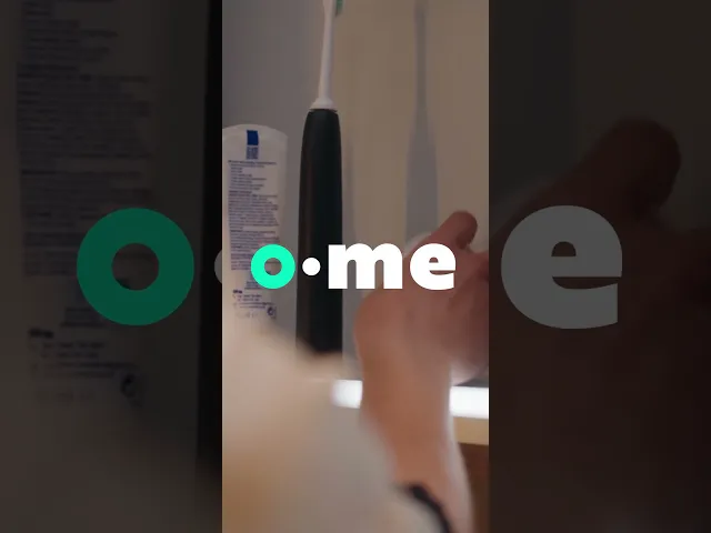
o•me
"A brand identity using a trendy routine to bridge the gap between self-care and checking for breast cancer"
Detailed Description
This is a visual identity for the breast abnormality scanning device by James Dyson Award Winner 'Dotplot'. In collaboration with Dyson Creative Team, Ben Charman, Alice Daniells, Morgan Heartley and I took on this incredible brief to create: O•ME
Services
Packaging Design
App Design
Brand Design
Industry
Dyson Creative
Year
2024
What's the brief?
Create a visual identity for the Dotplot
Extra Brief Details
What is Dotplot?
The James Dyson Award Winning device, Dotplot, has developed the first at-home breast health monitoring device. It's paired with a mobile app which allows users to track changes in breast tissue density with monthly scans and share detailed reports with healthcare professionals.
The visual identity for Dotplot's breast health device needed to include:
A device identity
A messaging hierarchy
Device product packaging
Device user instructions
Social media campaign
A device app.
Our branding also had rules:
Do not use pink as the main color.
Avoid saying the device detects breast cancer; it detects growth in breasts, whether the growth is cancerous or not.
Dotplot doesn't replace GP appointments, reduce NHS breast screening burden, or address wait times.
Avoid using the terms 'Diagnosis' or 'Diagnostic tool'.
Dotplot is an early warning system that identifies abnormalities, but doesn't diagnose them. Don't use the term 'patient' when referring to Dotplot users; instead, refer to them as users, customers, audience, or similar terms.
Our job was to figure out:
Who, Who? When? Where? (demographic, area, shops/at home)
Audience, Location, Channel
Design for the audience
Key Insight
We combined 4 concepts to create the logo and brand of: o•me
The word "ome", of Greek origin, referring to wholeness or to completion.
The circle, a calm and complete shape, with a smart color, referencing the completion of a routine as well as resembling a breast.
The dot in the middle used as a potential typographical outcome for "Dotplot" if it becomes a parent company.
The "me" stands out to allow for easier pronunciation, and more clearly plays into the "o•me time" into the user's "Everything Shower".
More Insight Details
From our research, we found a couple key bits of information:
In the UK, 55,000 women and 400 men are diagnosed with breast cancer every year.
Checking for breast abnormalities is not associated with taking care of yourself.
Most women will recieve their first breast cancer screening when they turn 50-53 years old.
For competitors, scanning felt scary and didn't flow into the user's routine
Outside of mammograms and clunky bra accessories, the Dotplot device is the most efficient and friendly way to check your breasts. We wanted to create a brand for Gen Z women to encourage them to check their breast regularly.
The Identity
Instead of scanning feeling scary like with other products, we made O•ME fit right into the "Everything Shower", turning it into something that fits into our target audience's routine.
Design Identitty Details
This reduced the stigma around checking, becoming an act of self-care through playful and friendly graphics, fun filters, and a smooth app experience.
Since most women don’t get their first screening until their 50s, O•ME helps bridge that gap by encouraging earlier, regular self-checks before formal screenings start.
This was a huge success! In just 9 days, we created a real contender for the brief. Our group faced the most challenges. First, a member dropped out, and the next day another group decided on the same name as us! Despite the odds, we really came through and absolutely smashed this out of the park. We were a very close second, we just needed more improvement to our social media. I’m very proud of this amazing outcome, and I hope I get more amazing briefs like this one in the future!
o•me TikTok video (motion graphics by me)

o•me device and app

o•me logos for different touchpoints

o•me apple watch

Instagram templates

Underground Poster Ad


o•me Pop-up Trial Stand

Routine-based Posters

Calendar, Measuring Tape, Bag

Tiktok & Snapchat Filters

o•me + Spotify Playlist